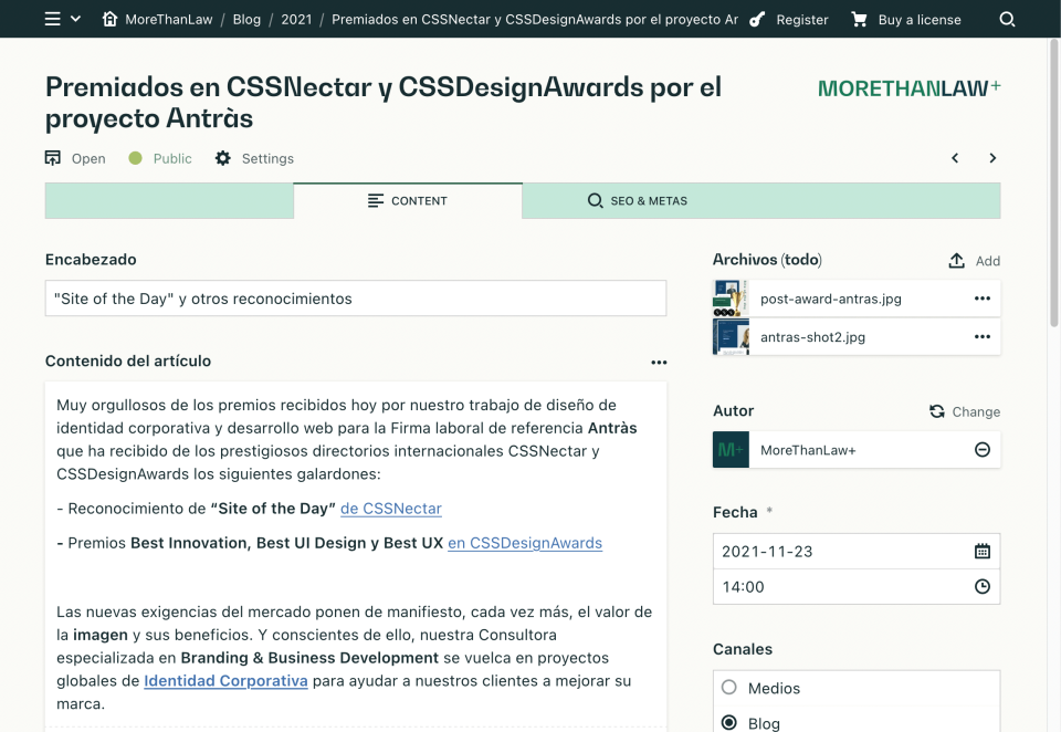
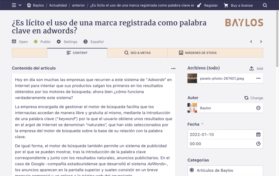
Branding the Panel to adapt it to yours or your client's brand
Today we are going to put the focus on a simple modification, that will, however, change the look & feel of the Panel significantly and create a more personalized experience.
As developers using Kirby, we usually make websites that we deliver to our customers in a personalized way. By modifying the styles of the Panel a bit, we will take this customization a little further.
The first thing we have to do is to add a custom Panel stylesheet and override the default styles.
To do so, register your custom stylesheet in your config.php, for example:
return [
  'panel' => [
    'css' => 'assets/css/custom-panel.css'
  ]
];
Now, we will load the fonts we need:
@font-face {
  font-family: 'bw_gradualbold';
  src: url('../fonts/bwgradual-bold-webfont.woff2') format('woff2'),
    url('../fonts/bwgradual-bold-webfont.woff') format('woff');
  font-weight: bold;
  font-style: normal;
}
Note that I have my fonts in the /assets/fonts folder.
If you want to include your own fonts, for example from Google Fonts, you can do it like this:
@import url('https://fonts.googleapis.com/css2?family=Merriweather&display=swap');With a few lines of CSS, we are now going to change the appearance of the whole Panel to adapt it to your brand:
:root {
  --color-gray-900: #182D31;
  --color-background: #F3F3F4;
}

.k-tabs {
  background-color: #f7e8d6;
}

.k-headline {
  font-family: 'Merriweather';
}

.k-header::before {
  float: right;
  content: '';
  margin-top: 10px;
  width: 150px;
  height: 35px;
  background-image: url('../img/logo-dark.svg');
  background-repeat: no-repeat;
  background-size: contain;
  clear: right;
}
You can play with margin-top, width and height on .k-header::before to adjust your logo correctly.
Here you have some examples:


As you can see, it is a simple adaptation that adds a logo, and modifies the base colors but you can go much further thanks to Kirby's UI Kit