Files section
List, edit and upload files
The files section can be used to show any combination of files for the current page or any other page in your site.
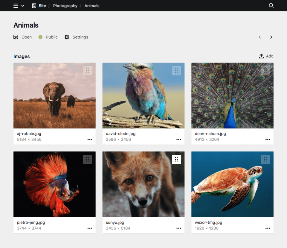
Example
title: Project

sections:
  gallery:
    label: Gallery
    type: files
    template: gallery
Section shortcuts
For simple sections that are only used once per blueprint, you can use shortcuts. In its most basic form, a files section consists of the section type as name, and true as its value.
sections:

  files: true
This will add a files section with all default properties.
These shortcuts can be extended with other section properties as needed, for example:
sections:

  files:
    label: My Files
    template: cover
Keep in mind that the same section name can only be used once per blueprint.
Section properties
The files section has multiple options to control what kind of files should be displayed, how they should be displayed and what happens if a new file is uploaded.
| Name | Type | Default | Description |
|---|---|---|---|
| columns | array |
– | Columns config for layout: table
|
| empty | – | Sets the text for the empty state box | |
| flip | bool |
false |
Enables/disables reverse sorting |
| headline | – | The headline for the section. This can be a simple string or a template with additional info from the parent page. | |
| help | – | Sets the help text | |
| image | – | Image options to control the source and look of preview | |
| info | – | Optional info text setup. Info text is shown on the right (lists, cardlets) or below (cards) the title. | |
| label | – | The label for the section. This can be a simple string or a template with additional info from the parent page. | |
| layout | string |
list |
Section layout. |
| limit | int |
20 |
Sets the number of items per page. If there are more items the pagination navigation will be shown at the bottom of the section. |
| max | int |
– | Sets the maximum number of allowed entries in the section |
| min | int |
– | Sets the minimum number of required entries in the section |
| page | int |
– | Sets the default page for the pagination. This will overwrite default pagination. |
| parent | string |
– | Sets the query to a parent to find items for the list |
| search | bool |
false |
Enable/disable the search in the sections |
| size | string |
auto |
The size option controls the size of cards. By default cards are auto-sized and the cards grid will always fill the full width. With a size you can disable auto-sizing. Available sizes: tiny, small, medium, large, huge
|
| sortBy | string |
– | Overwrites manual sorting and sorts by the given field and sorting direction (i.e. date desc) |
| sortable | bool |
true |
Enables/disables manual sorting |
| template | string |
– | Filters all files by template and also sets the template, which will be used for all uploads |
| text | {{ file.filename }} |
Setup for the main text in the list or cards. By default this will display the filename. |
Label
The label will be displayed above the files section. You can pass a simple headline as a string or you can provide translations for multiple languages, if you have an international editing team.
Single language
label: GalleryMultiple languages
label:
  en: Gallery
  de: Galerie
  es: Galería
Placeholders
You can inject information from the current page into the label with template placeholders using our query language.
label: "{{ page.title }} Gallery"Layout
The files can either be displayed as a simple list or as cards with preview images. The list view is the default view.
List layout (default)
The list layout is perfect for file types without thumbnails like PDFs, excel files, or any other docs. It can also be quite helpful for long galleries that would take up too much space as cards.
layout: list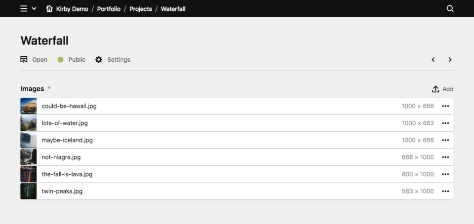
Cards layout
The card layout is great for all kinds of images.
layout: cards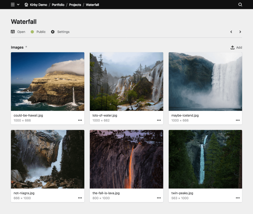
Cardlets layout
The cardlets layout is great for nice visual previews of files, while your text content is still representend decently.
layout: cardlets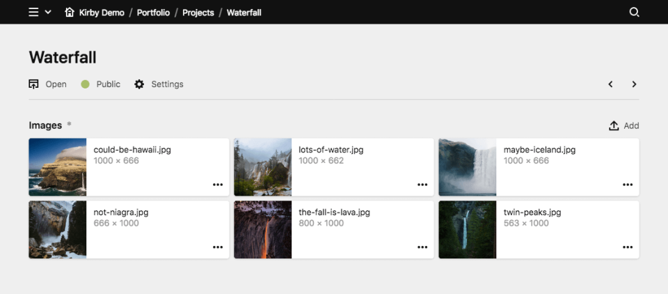
Table layout
The table layout has the highest information density. Columns can be fully customized and make it perfect if you need to show multiple values at once for better overview and scannability.
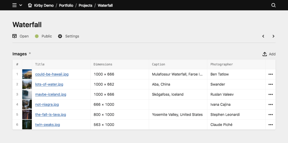
layout: tableThe table layout will show the preview image together with a title and info column based on your text and info settings. You can switch off those automatic columns with image: false, text: false and info: false if you want to introduce your own columns.
Columns
Custom table columns can be defined with the columns option.
layout: table
columns:
  alt: true
  dimensions: true
Each column can be customized with additional settings:
Label
layout: table
columns:
  alt:
    label: Alt Text
Translated label
layout: table
columns:
  alt:
    label:
      en: Alternative Text
      de: Alternativ Text
Alignment
Text alignment can be left (default), center or right.
layout: table
columns:
  dimensions:
    label: Dimensions
    align: right
Width
The column width can be set via the width property. You can use the usual fractions:
layout: table
columns:
  dimensions:
    label: Dimensions
    width: 1/6
Value
By default, the table cells contain the field value matching the column name. You can customize the value with a string template.
layout: table
columns:
  date:
    label: Date
    value: "{{ file.date.toDate('d.m.Y') }}"
HTML
Values are converted to safe HTML by default. This is the most secure way to handle content in your Panel. If you know what you are doing and you want to render HTML in a table cell, you can use the html option to stop HTML from being auto-encoded.
layout: table
columns:
  html:
    label: HTML
    html: true
    value: "{{ file.someSafeHTML }}"
Mobile
Set the mobile option to true for a column to be visible in the mobile view.
layout: table
columns:
  alt:
    label: Alt
    mobile: true
Type
So far we offer three different column types, you can use to improve the preview of your data.
| type | description |
|---|---|
text |
This is the standard column type |
url |
If the value is a URL, you can convert the value to a link with this type |
tags |
If the value is a comma-separated list of values or an array, you can use this type to show the value as tags. |
File information
You can fine-tune the display text and additional information for every file in the list with the text and info options.
text
By default the filename is shown in the list for every file. You can use our template syntax with query language to fetch any information from the file and display that instead of the filename.
text: "{{ file.alt }}"info
If you want to display additional information for each file, like a caption, category or any other field value, you can use the template syntax with query language in the info option.
info: "{{ file.dimensions }}"Restricting uploads to certain file types
If you want to restrict what types of files can be uploaded to the given section, assign a file template using the template property. In your file template, set the accept option. See the docs about file blueprints.
By default, Kirby supports the following files types.
To upload file types not supported out of the box by Kirby, you can register new file types with the fileTypes extension in a plugin.
Preview images
The (preview) image for each item in the list is configured with the image option:
cover
Whether or not the image will cover the available space.
Options: true, false (default)
image:
  cover: true
Examples
ratio
A freely definable image ratio.
image:
  ratio: 16/9
Examples
You are not limited to the example ratios above. In fact, Kirby calculates the ratio for you as long as you enter it in the format a/b
back
Set an image background.
Options: pattern (default), black, white
image:
  cover: true
  ratio: 1/1
  back: black
Examples
Empty state
With the empty option you can define the message which is displayed when no files are listed in the section.
empty: No documents yetFiltering files
parent
By default, the current page is being used as the parent to find files for the list. With this option, any page on your site can be the parent of the section.
parent: site.find("galleries").firstTemplate
You can define which template each file in the list must have. This template option will also be applied to any new file that gets uploaded. Blueprints for file templates can be setup in /site/blueprints/files.
template: coverSorting
sortBy
You can sort the list of files by a given field in descending or ascending order.
sortBy: filename descYou can pass PHP sorting type flags, for example to make sorting work with special language specific characters.
sortBy: filename SORT_LOCALE_STRING
sortBy: filename asc SORT_LOCALE_STRING
The sortBy option will automatically switch off manual sorting.
sortable
You can switch off manual sorting entirely with the sortable option.
sortable: falseflip
Use the flip option to enable/disable reverse sorting (default is false):
sortBy: filename
flip: true
Limits
limit
The limit property sets how many files will be shown per page. If there are more entries in the section, the pagination navigation will be shown at the bottom of the section.
limit: 20max
You can define a maximum number of files, that will be allowed in this section. After the maximum is reached, the upload button will be hidden and no more files can be uploaded.
max: 10min
You can also define the minimum number of files, that need to be added in order to make the parent page valid.
min: 2Conditional sections
Like conditional fields, sections can be shown/hidden based on the value of a given field (i.e. if a toggle is checked, a select field is at a certain option, etc.).
The condition for displaying the section is set with the when option. In the when option you define a field name as the key and the required value of that field. In the following example, the each section type is shown based on a different value of the postType field:
sections:
  content:
    type: fields
    fields:
      postType:
        type: select
        options:
          - Gallery
          - Image
          - Text
  gallery:
    type: files
    template: gallery-image
    layout: cards
    size: tiny
    when:
      postType: Gallery
  image:
    type: files
    template: single-image
    max: 1
    layout: cards
    when:
      postType: Image
  text:
    type: fields
    fields:
      text:
        type: textarea
      tags:
        type: tags
    when:
      postType: Text
Search
Section search is disabled by default. You can use the search option to enable it.
sections:
  gallery:
    type: files
    search: true
Fetching files in the frontend
Through a section, you upload files to a page, either the current page or another parent page. Contrary to a files field, the file does not become part of the content, i.e. it is not referenced in the content file.
If you assign a file template to a particular section, you can filter by this template when fetching files in the frontend.
Assuming a files section like the following which uploads images to the current page and assigns a template called gallery:
sections:
  gallery:
    type: files
    template: gallery
You can then fetch those files in the frontend like this:
<?php $galleryImages = $page->images()->template('gallery'); ?>
<ul>
<?php foreach ($galleryImages as $image): ?>
    <li><img src="<?= $image->url() ?>" alt="<?= $image->alt() ?>"></li>
<?php endforeach ?>
</ul>


